PlutoTV Brand Site
Digital brand guide for Pluto TV in their playful yet informative tone of voice that can be accessed by different teams.
web design
user experience
wireframing
client relations
Client
Pluto TV
Role
Design Lead
Duration
2.5 Months
Team
Laura Rush, Jocelyn Beaucher
Overview
As technology and communication evolves, there are more reasons than ever to have an online, user-friendly resource hub for teams to go to for everything and anything about their brand. PDF maintenance can be a slog and design program knowledge shouldn’t be a requirement. Our solution is to build an accessible website for these teams so that they can efficiently pass information around through a single link. I designed and built the design system within Figma, created all of the different components, as well as facilitated client and dev handoffs. Collaborating directly with our developer throughout the process allowed me to ensure that both design and dev were aligned from day one.
Goal
Design a resource hub for Pluto TV’s brand while upholding their fun and playful personality, making it uniquely them. It should be an accessible and shareable website for Pluto TV internally and their external partners.
Competitors
There are a few brand guideline site makers out there like Standards Sites, Corebook, and Brandpad. I researched the different ways they present brand guide information, from navigations to what is live text vs. an image asset.
How do they adapt different brands’ content from site to site?
How are section structures reused throughout the site?
How do the brand sites achieve clear navigation?
Key takeaways
Clearly organizing each section in the brand guide to their own pages for more in-depth brands work well. Shorter brand guides don’t necessarily need many pages and can typically use one page.
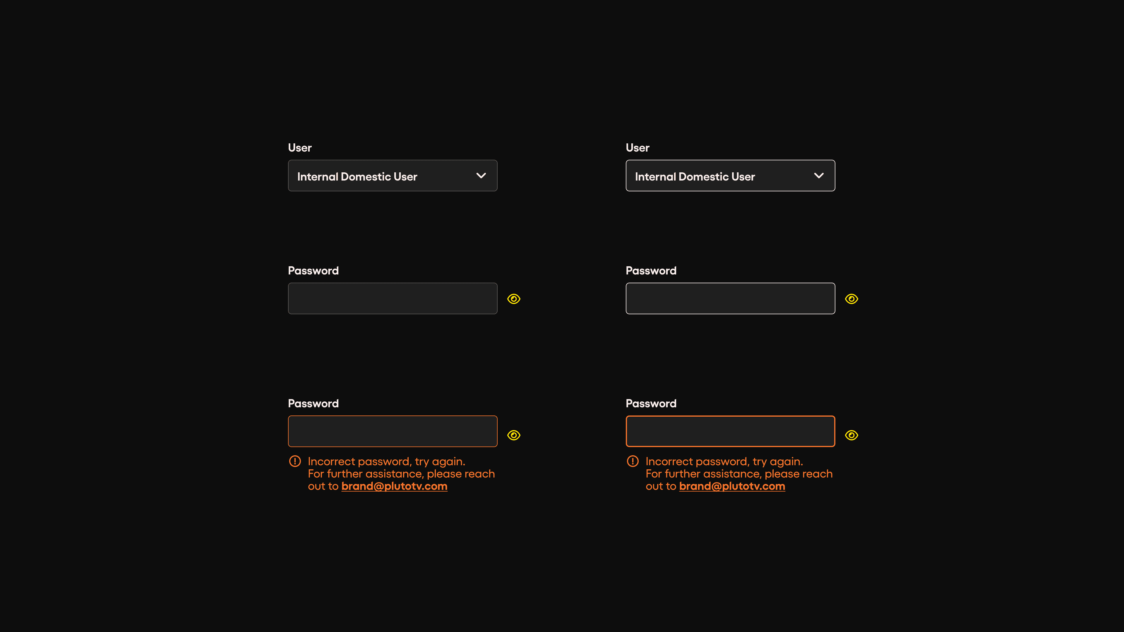
Pluto TV had a desire to be able to update on their own, so we needed to make sure that content was laid out in a way that could be easily understood in a CMS structure.
Many of these brand sites are not entirely responsive, however, we wanted to make sure that users can view the site on any device. But we did know that it would be rare for a user to be viewing it on mobile.
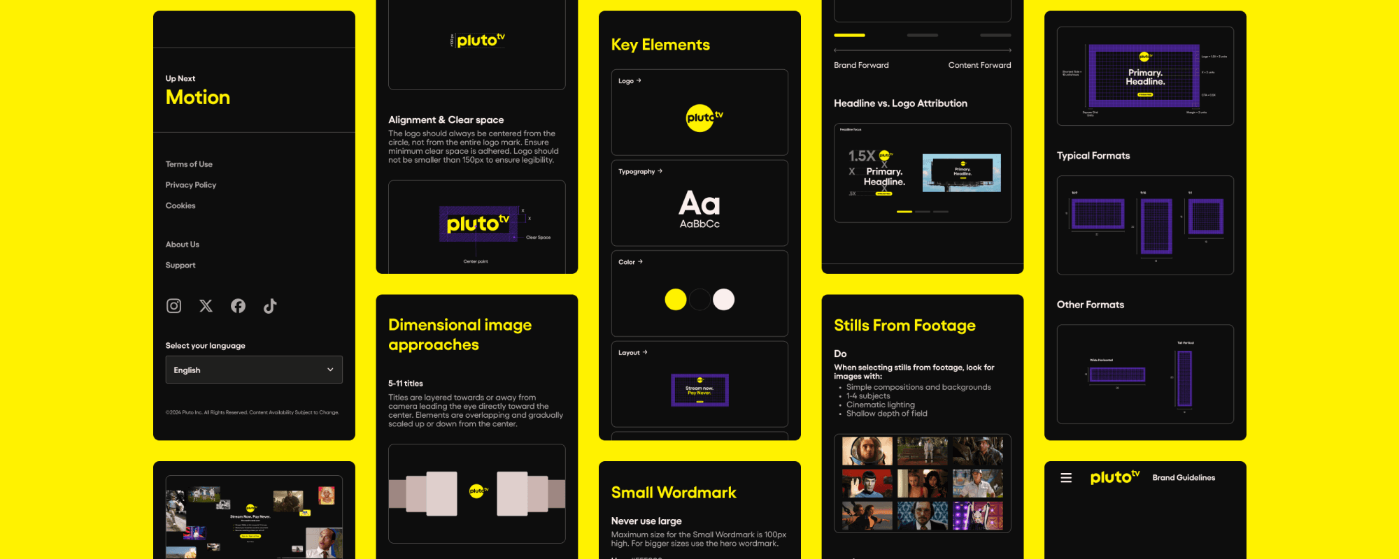
Content Priorities
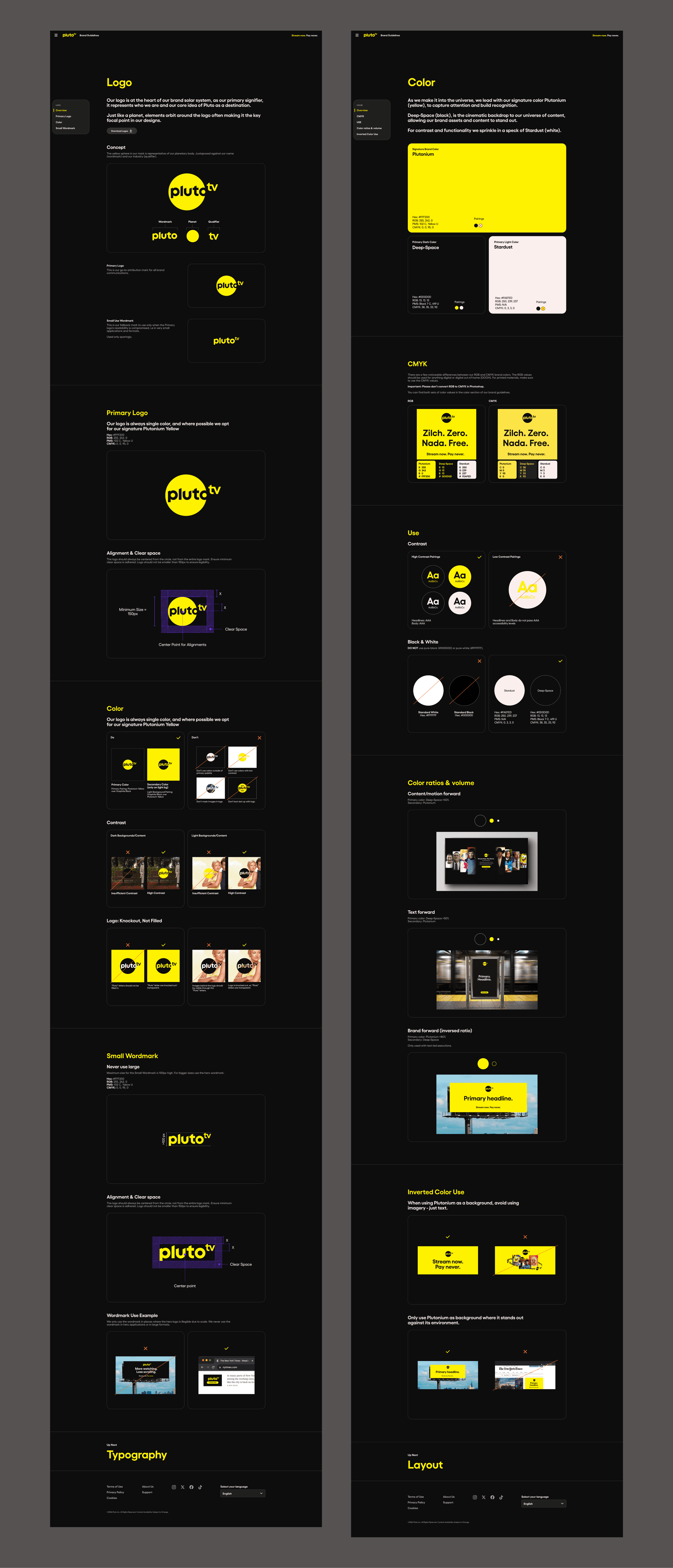
After meeting with Pluto TV’s team, one of the biggest priorities for this site is for teams and external partners and press to be able to quickly download assets, specifically logos. There was a desire to move the visual identity to the forefront and have a bit more of a resource library feel first. This is why the visual identity leads the landing page and is one of the first pages a user will see when logging in.
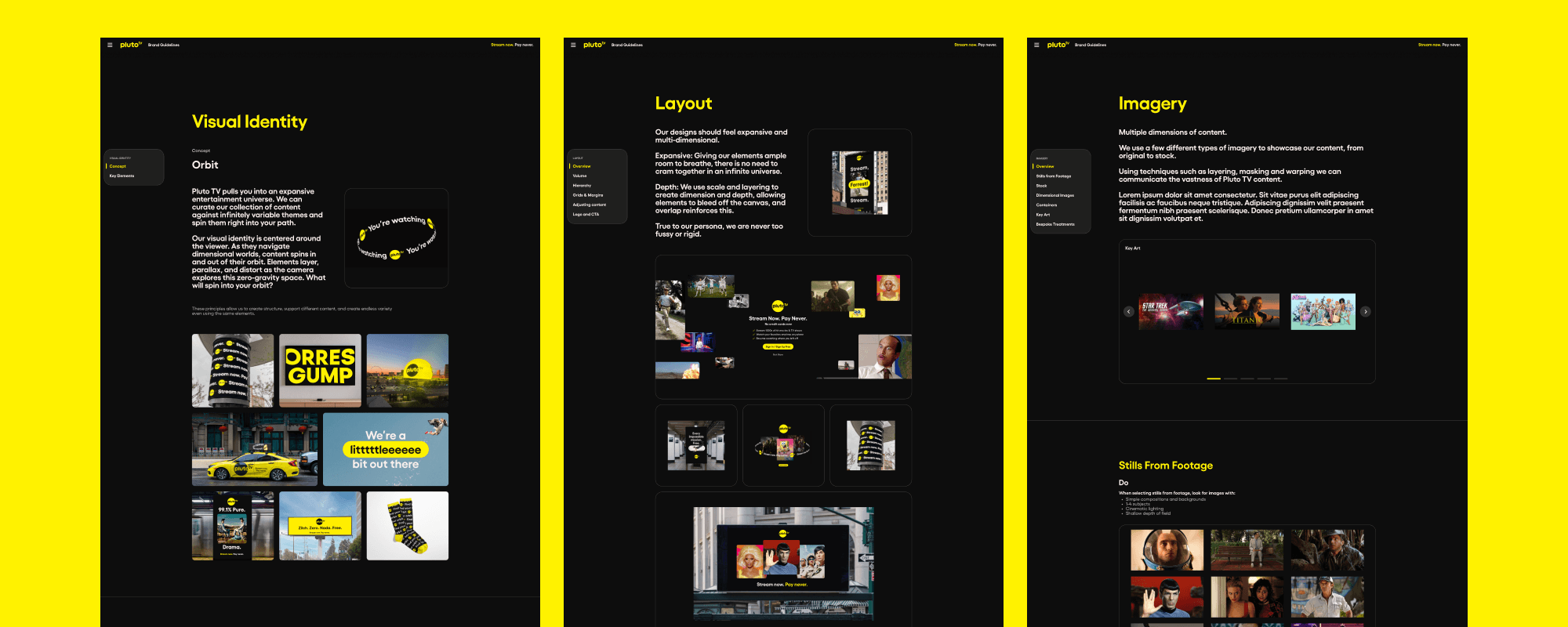
Understanding visual identity
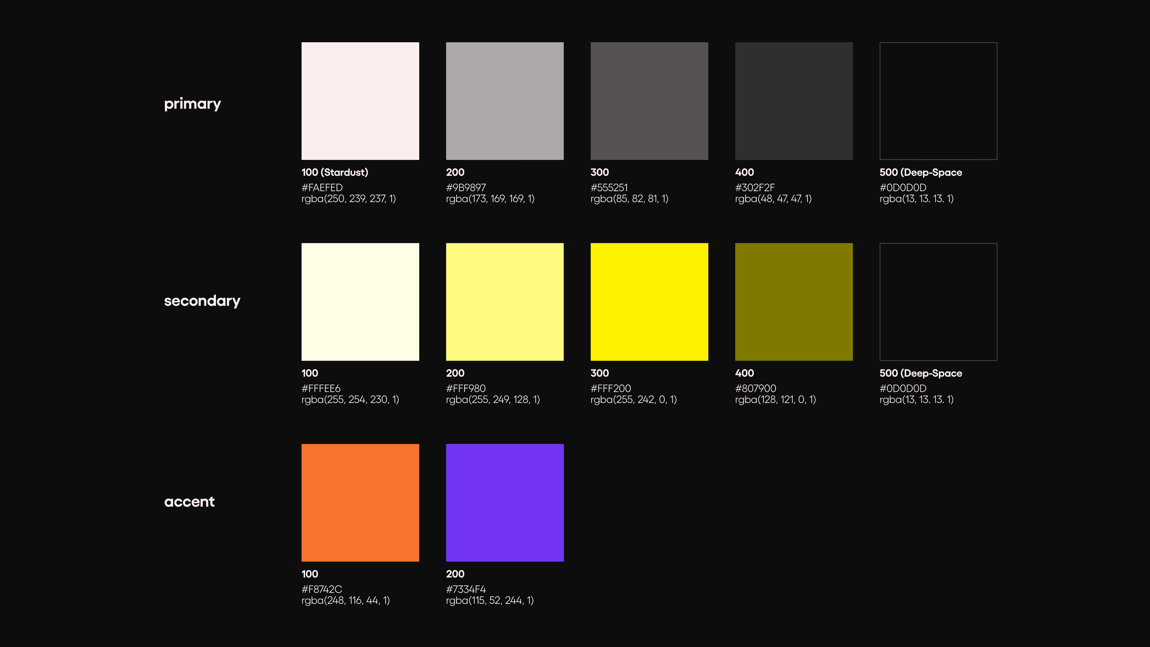
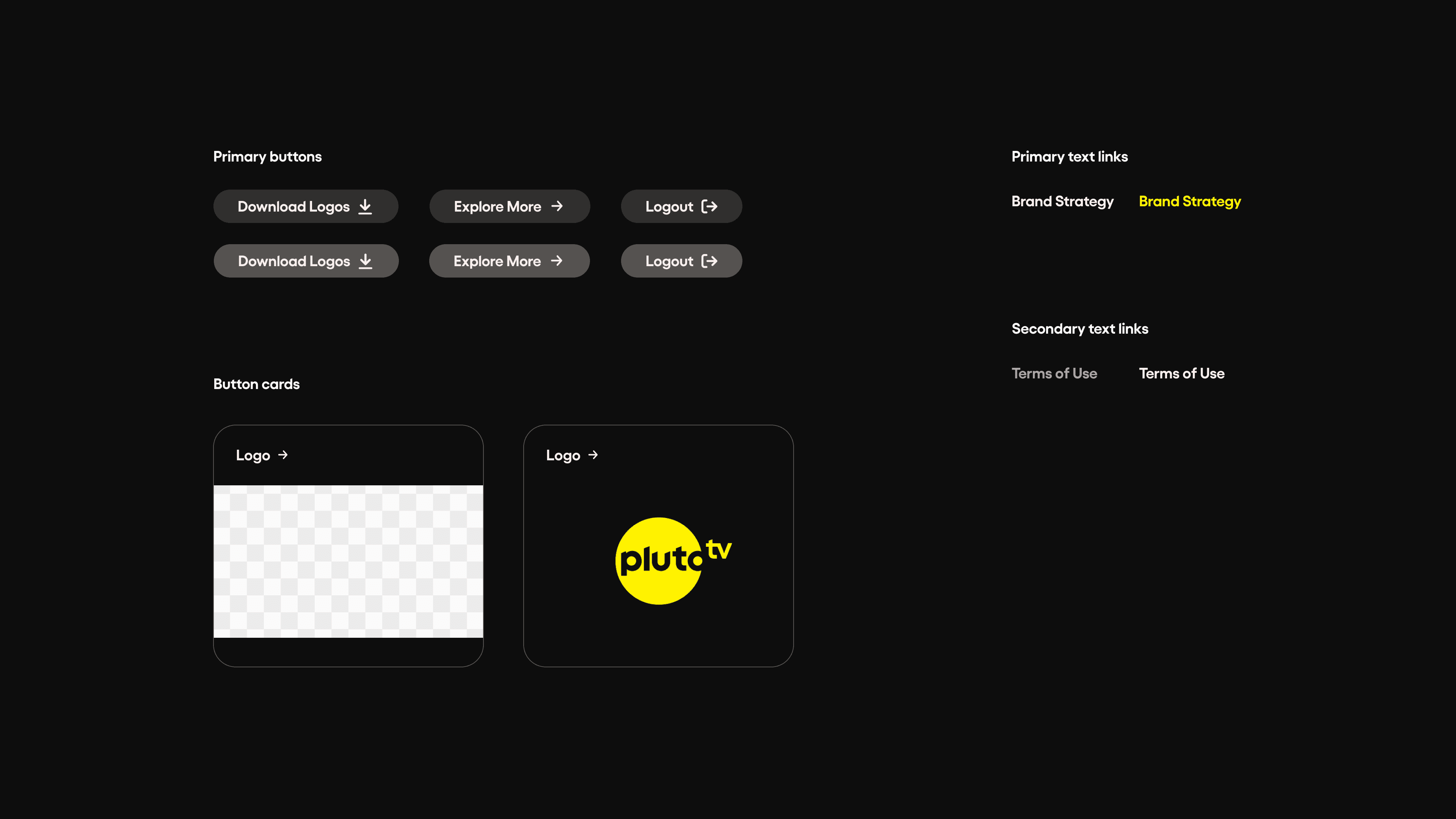
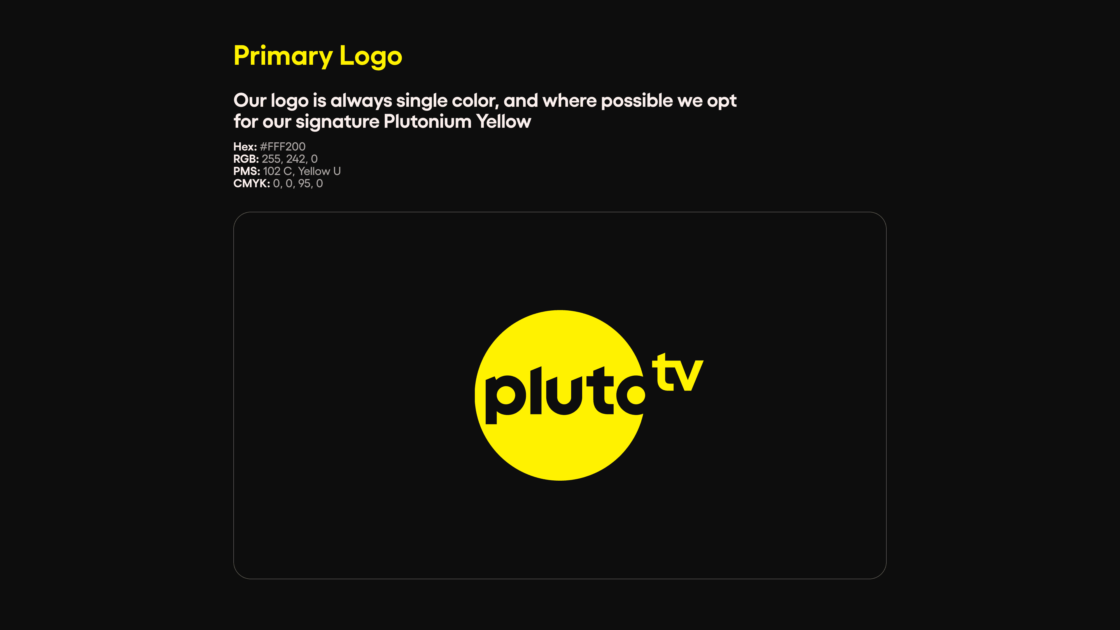
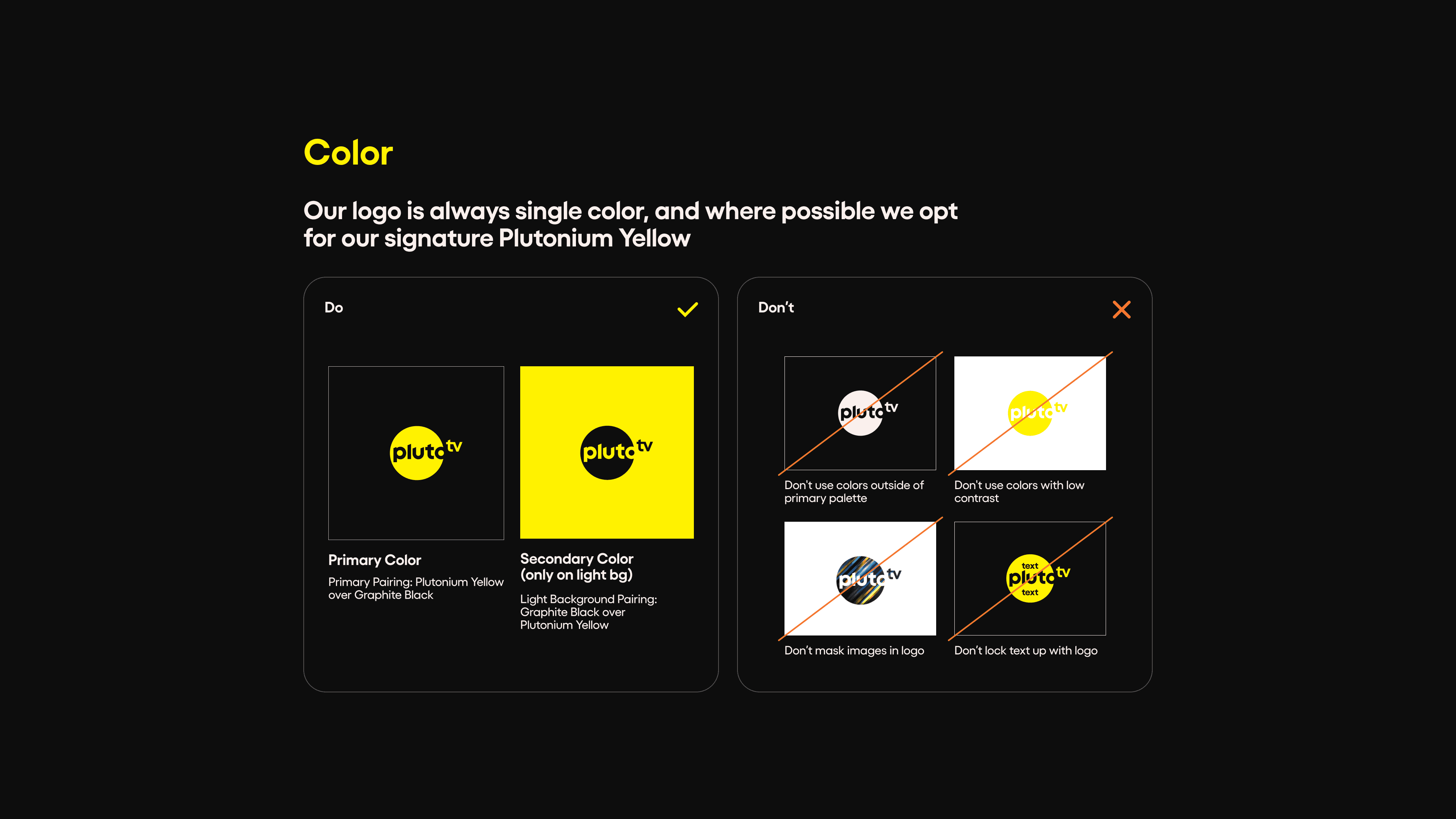
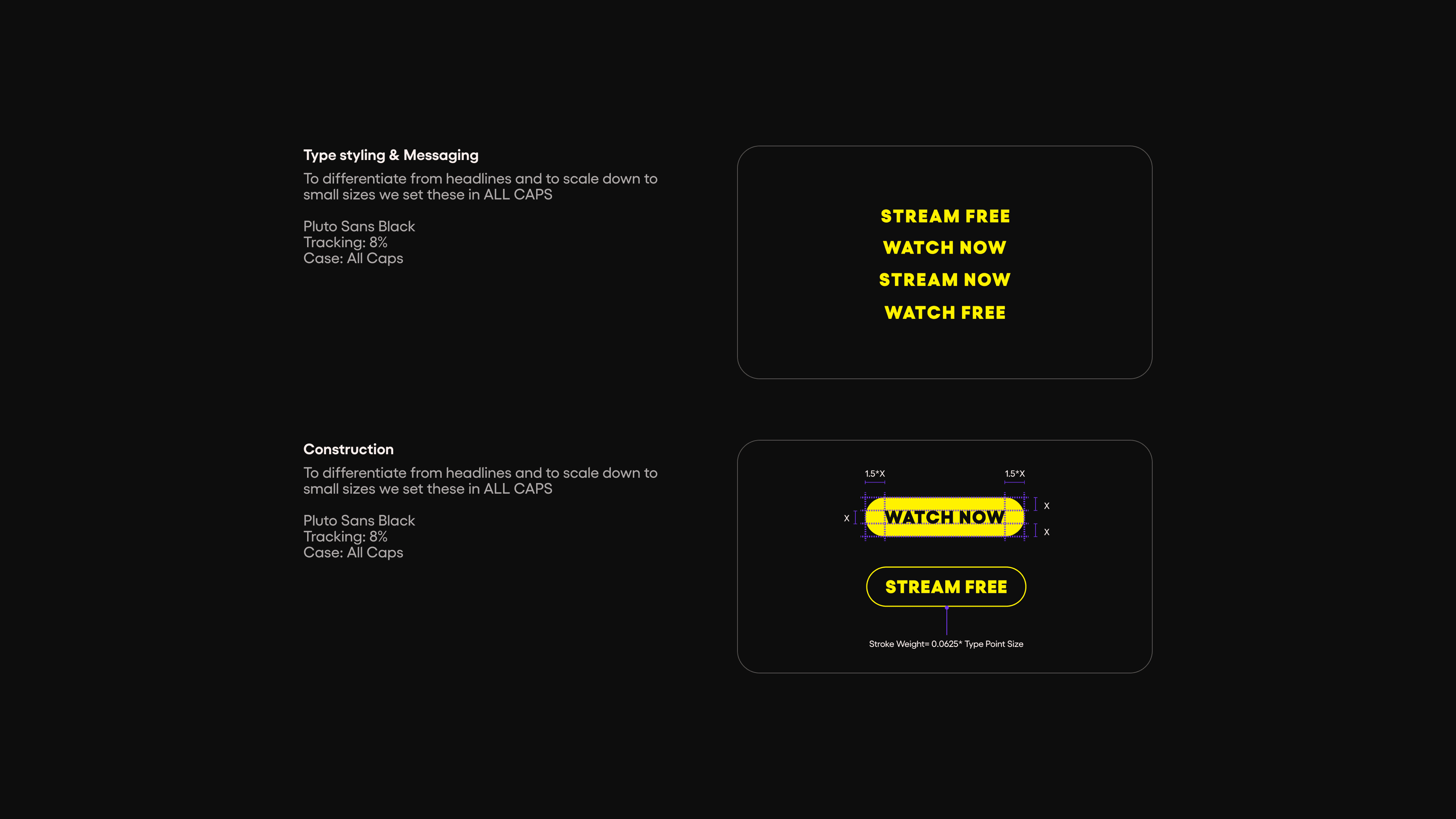
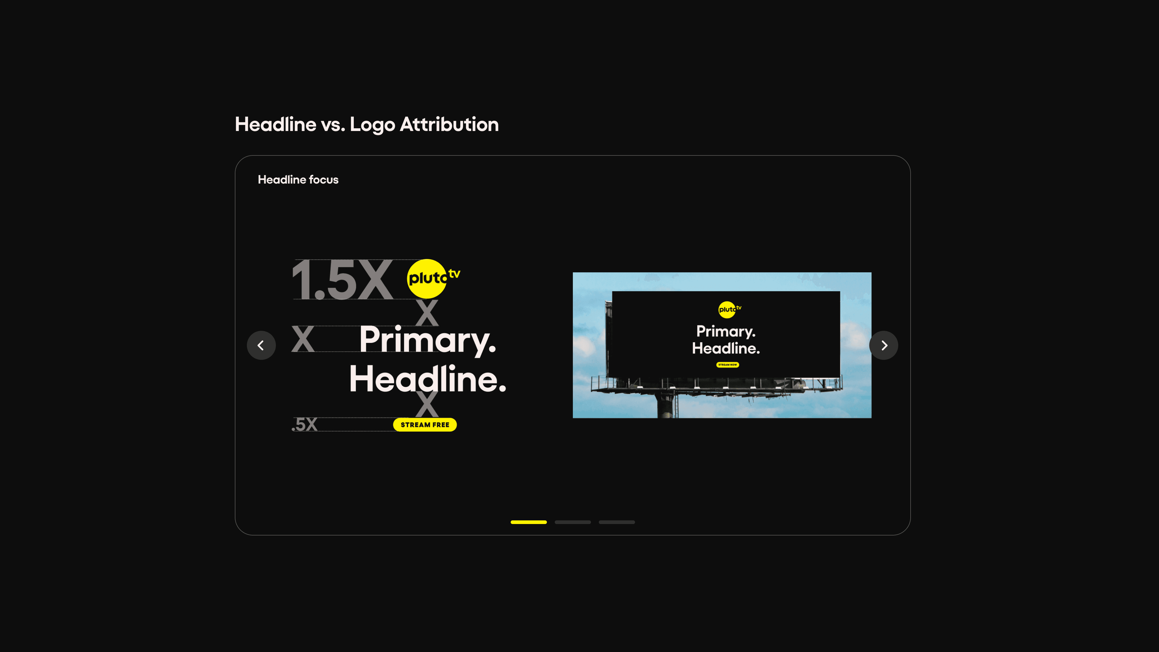
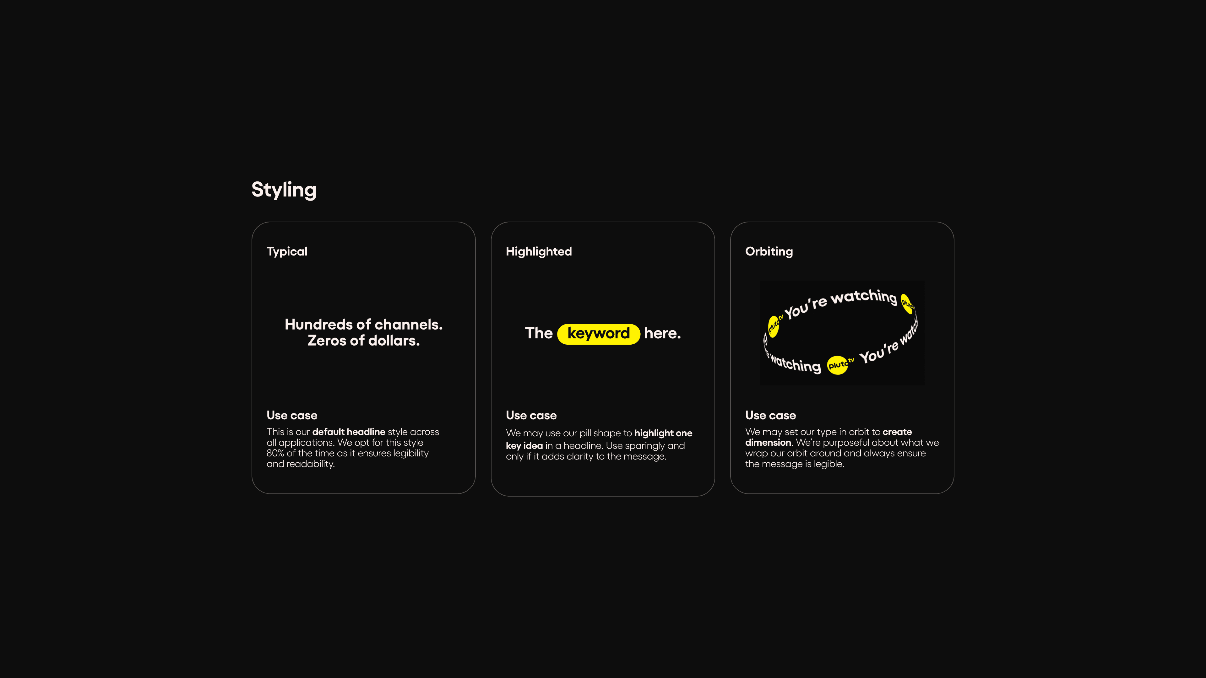
The visual identity for the site took inspiration from both Pluto TV's platform and their PDF brand guide. I developed a range of shades from Stardust to Deep-Space and several tones of their Plutonium Yellow. Because the brand is so round and playful, I opted for rounded edges, rounded buttons, and large typography to match the energy.
Building the design system
Using what we know about the brand's visual identity, I built out the color, sizing, and typography variables for the site. Tokens like the backgrounds we use are named bg-primary and bg-secondary, pulling from the foundation colors primary-100 and primary-500.
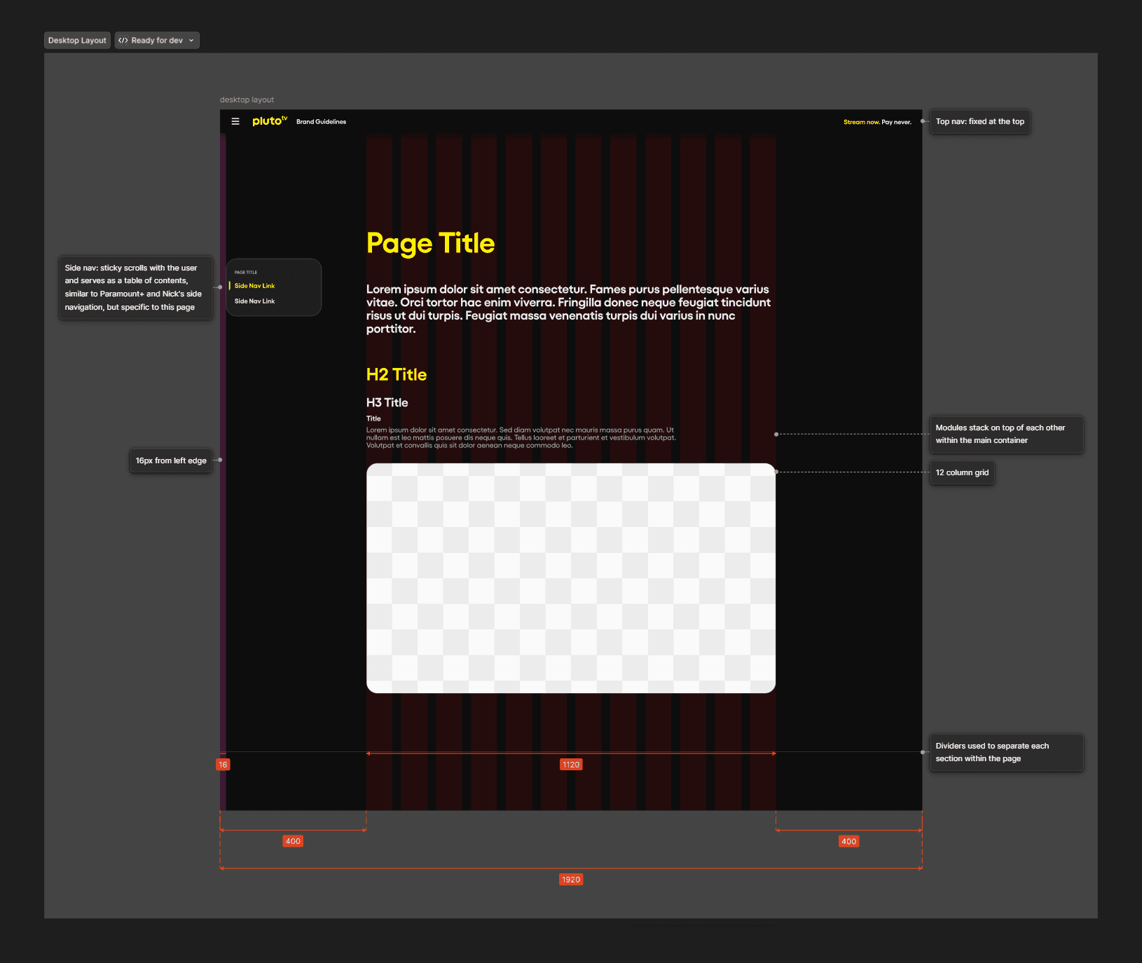
Layout
Every content page is structured the same way, using a page-intro component module and CMS content modules. Below are the annotations provided to our developers.
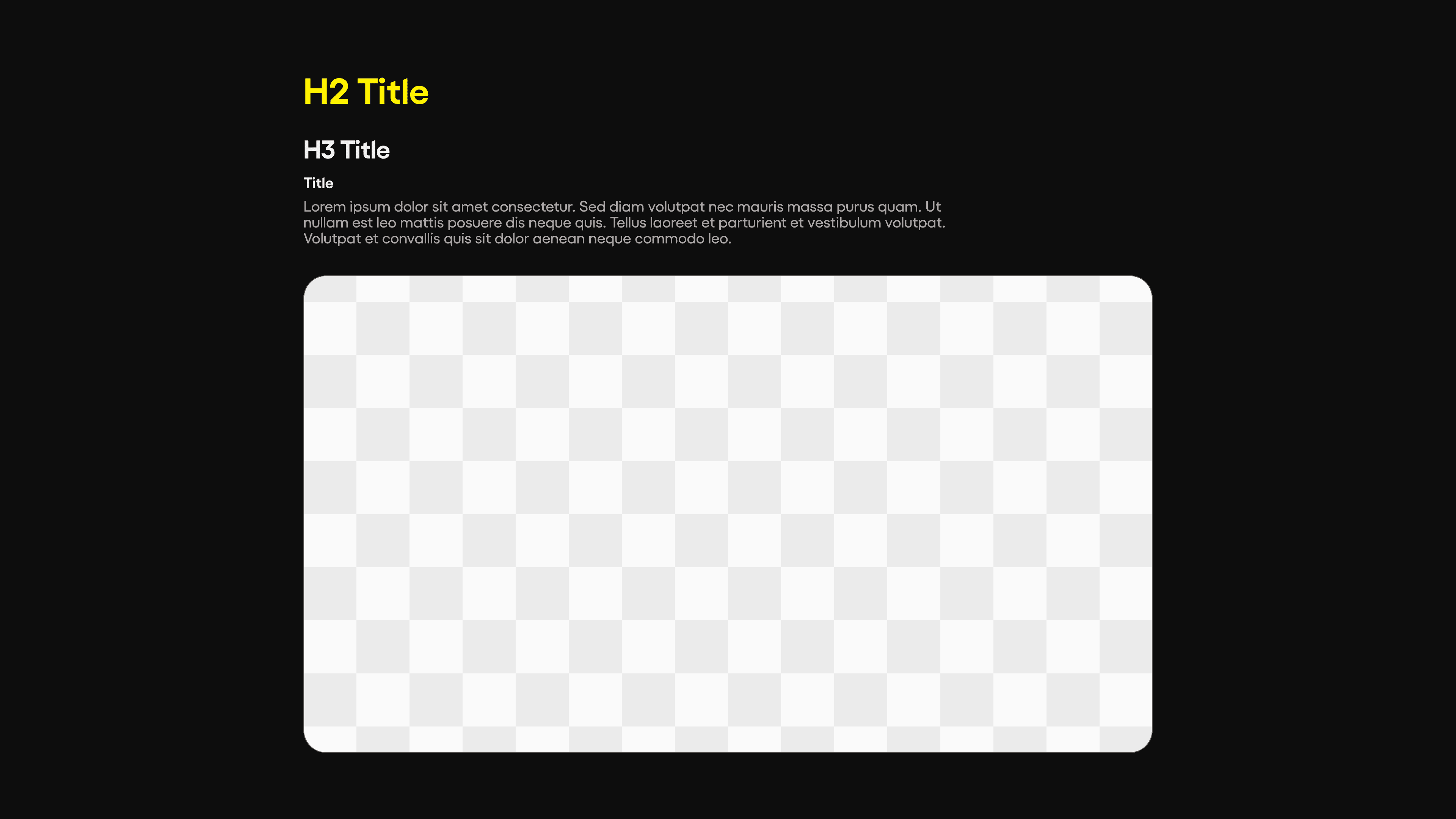
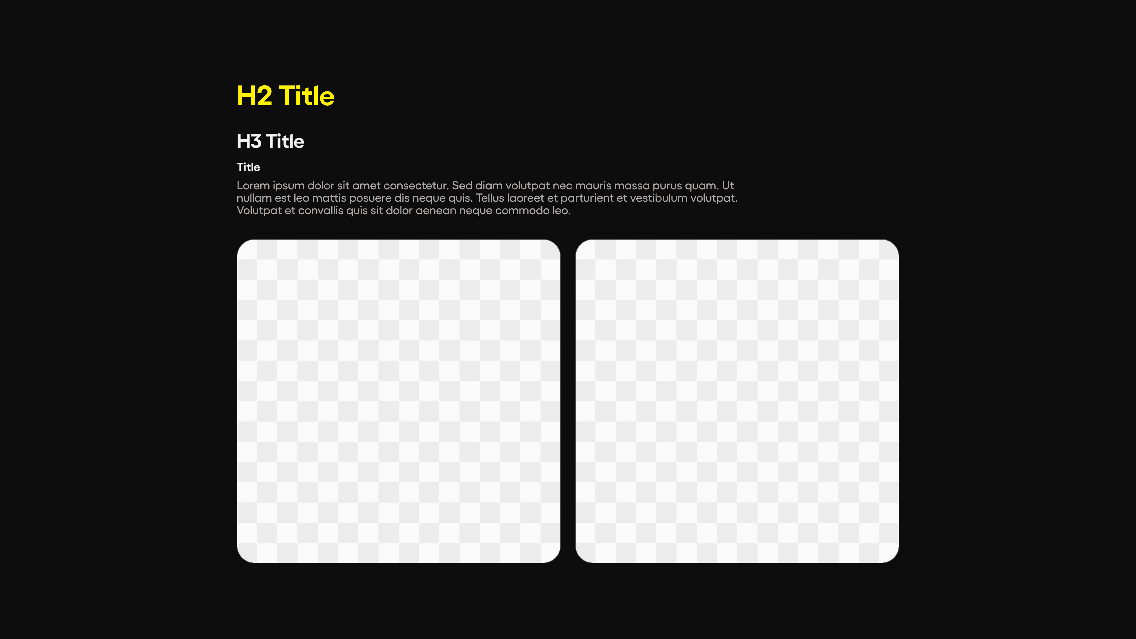
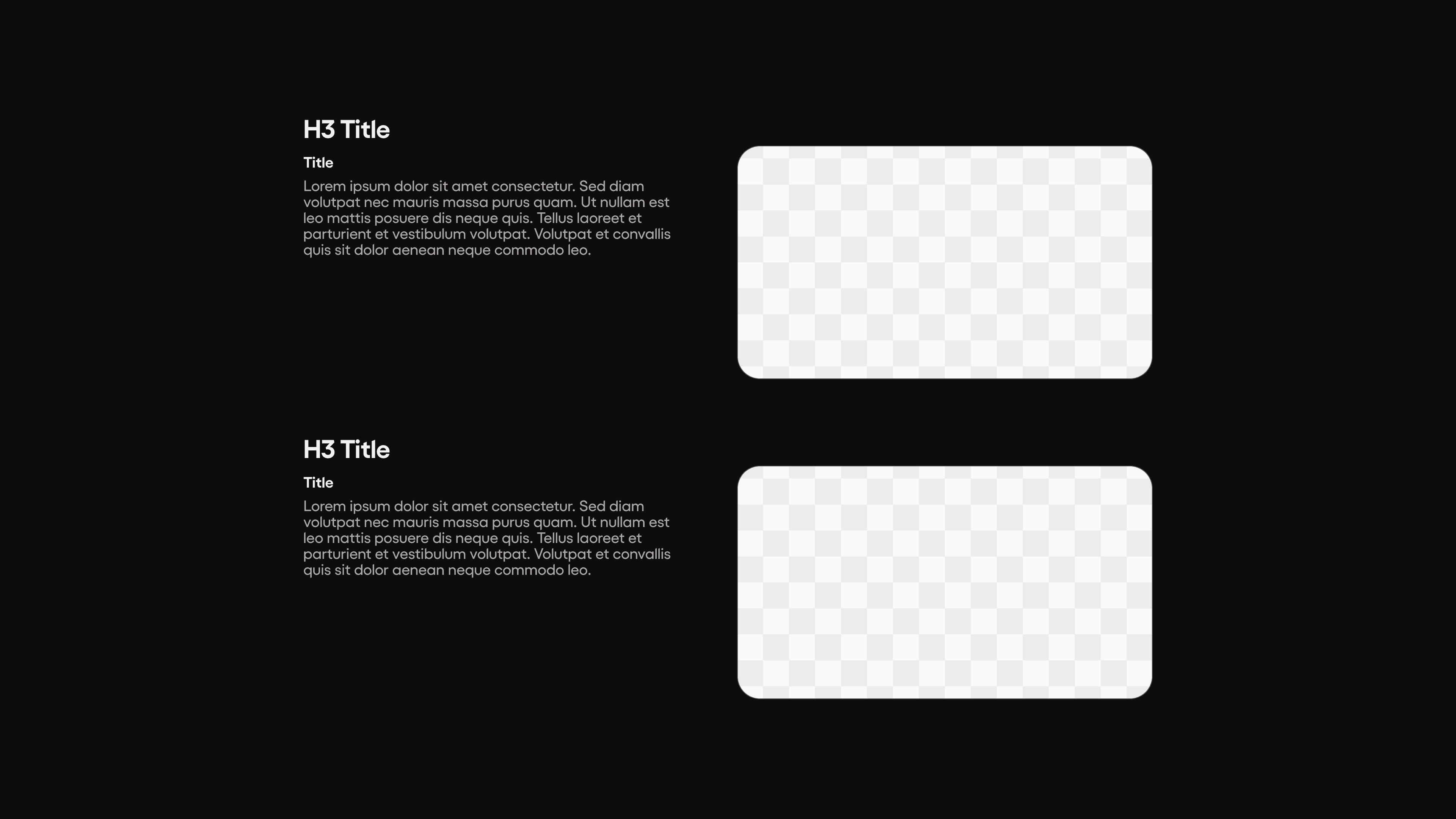
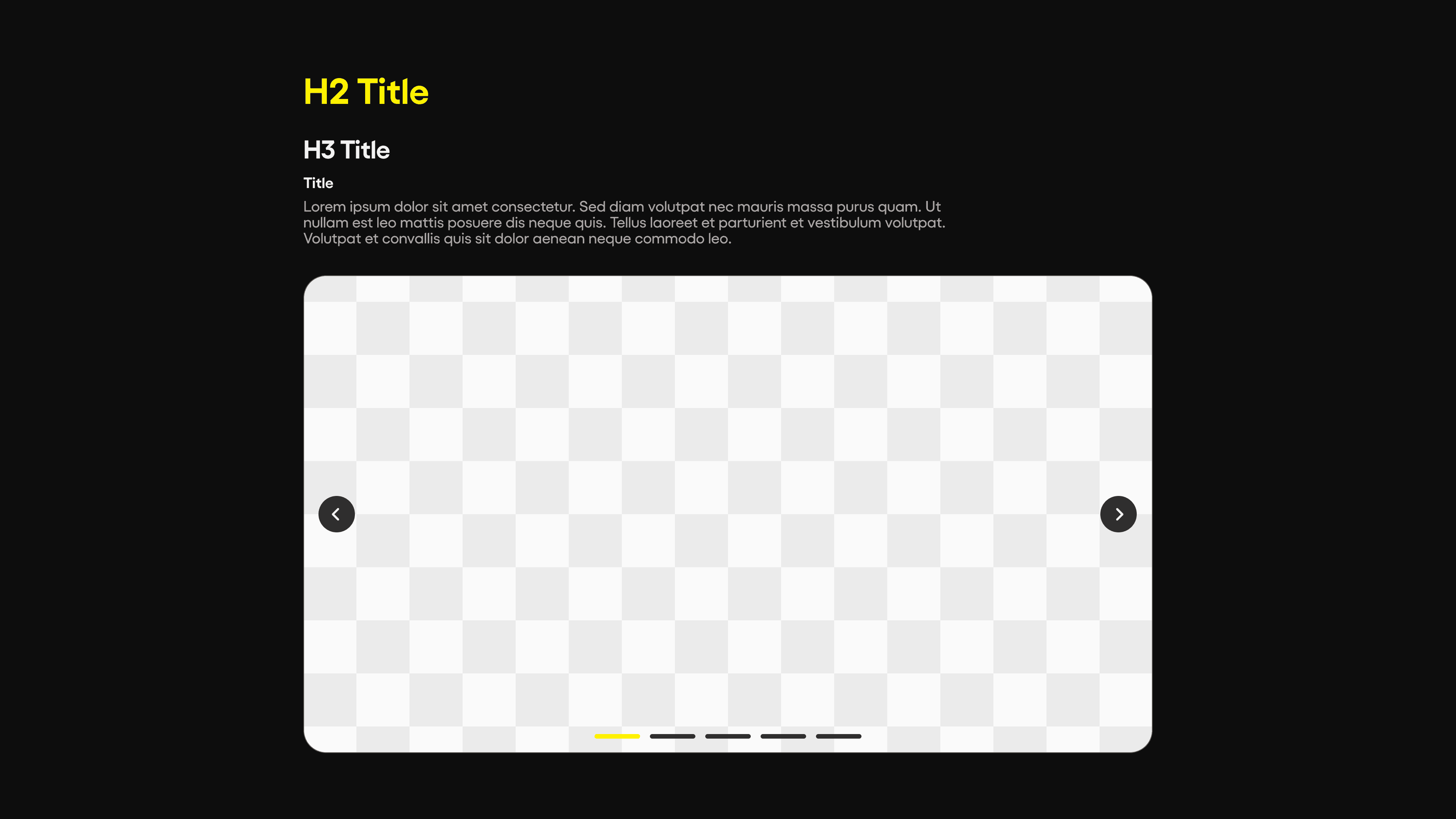
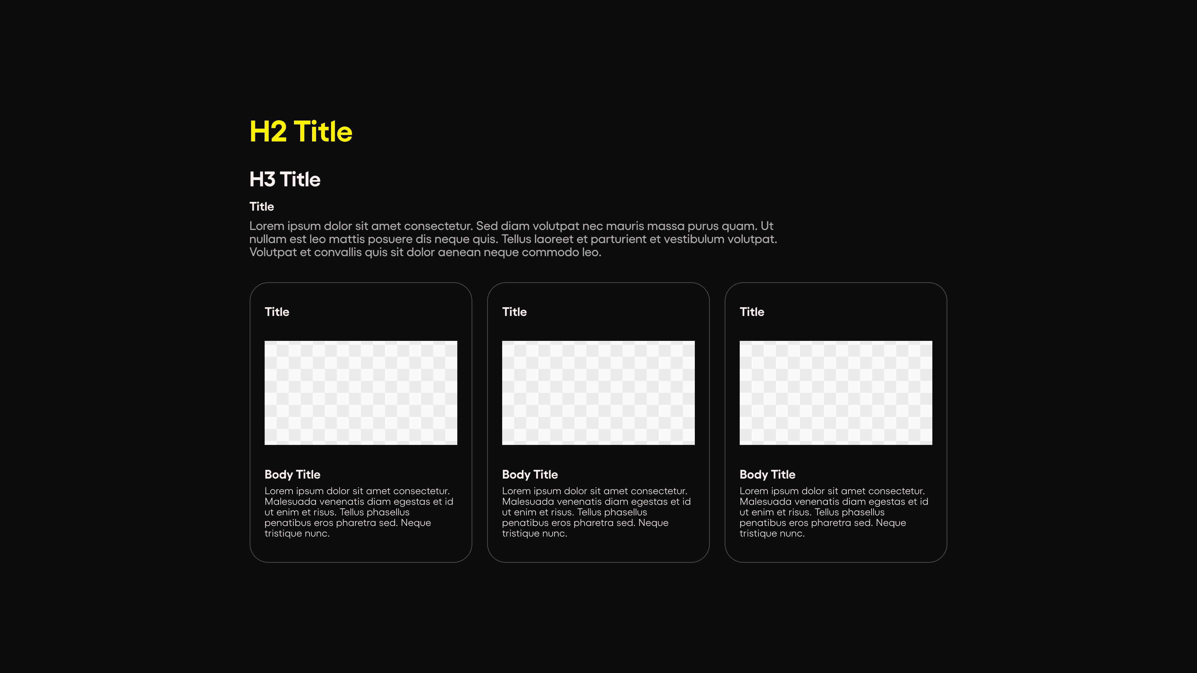
CMS Content Modules
The meat and bones of the site lay in the CMS content modules, where text and image assets can be uploaded into the site. These modules can be reused throughout the site on any page and stack with any content (image or video) the client wishes to share.
Large image
Medium images
Text + small image
Carousel
Card trio
Tabs Exploration
Pluto TV uses the pill shape in order to emphasize key words, which is also the same treatment that our buttons have, leading to an issue with interactive tab pills feeling visually conflicting. In order to differentiate what is interactive when we have pill shapes within images, we explored additional tab treatments. We landed on rounded tabs that sit within the signature rounded shape that is seen throughout the site. I value ideating quickly by prototyping so we can make sure that the decision we make is ultimately the best one.
Conclusion
The Pluto TV team has expressed appreciation for the deep collaboration on this project. Designing this site also improved some information layout within the PDF brand guide. The internal teams and vendors have found this brand hub to be extremely helpful and hits the goal of being the indisputable source of truth for all things Pluto TV brand.